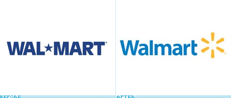
Walmart* just gave up one of their truly unique branding opportunities. When one typed out their initial logo, instead of a dash, most would use a star (or asterisk). Wal*Mart. It’s a truly unique position they had put themselves into, by being able to separate their brand name with an non-traditional ASCII character. Where most would use dashes, Wal*Mart got the star. Even further, their letter pairings, caps vs. lowercase, and general rhythm of the appearance of the word worked quite well.
Now their logo is followed by the star. Walmart*. Now it looks like their brand is followed by a caveat. The word mark as typed in plain text, “Walmart,” is not nearly as graceful or rhythmic as the previous.
Don’t get me wrong. Walmart*’s logo needed a major update to appear more friendly towards it’s customers (the weight of those letters was more representative of the burdens it imposes onto most of it’s workforce, than the “friendliness and convenience” it wanted to convey) but with this solution they removed a lot of it’s branding ability from the common people it relies on most.
And what does that star burst mean, anyway? It went from something conveying some kind of vaguely American values to something more immediately techy and dot com-y.
For a company that is so prevalent you would think there would be an impetus to make that brand work for them, but it really reminds me of what the chain has to go through every time it wants to open another store: a struggle to justify it’s existence.
Thanks to Brand New for the notice.